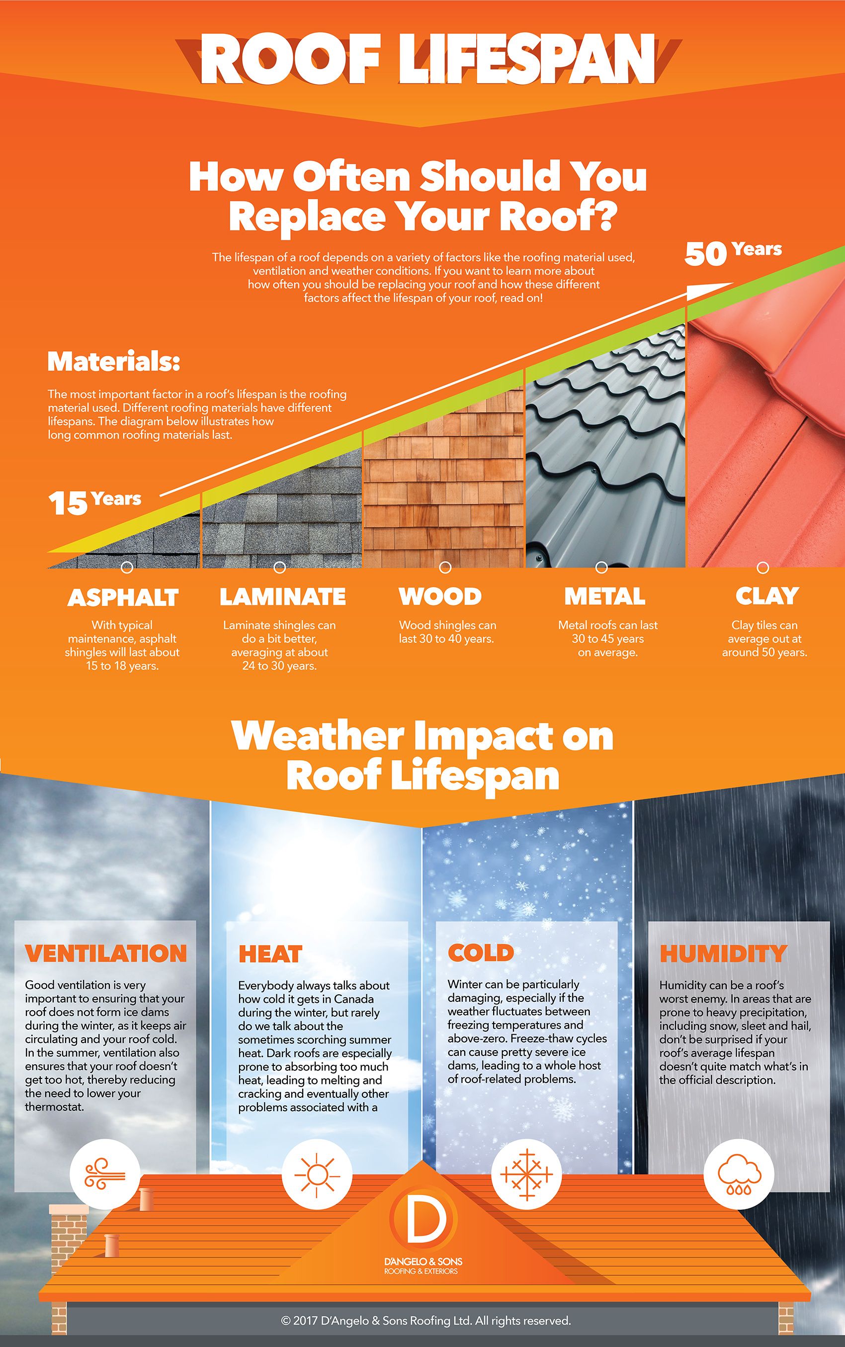
Infographic : How Often Should I Replace My Roof

For people who own a home, it’s often easy to overlook the importance of roof maintenance and replacement. Indeed, most don’t act until a problem strikes. But roofs have a limited lifespan and it’s important to know when it’s up.

That’s why www.dangeloandsons.com created this infographic. They wanted to present this important information to homeowners in a more visual way. They laid the main issues that affect roof lifespan: the kind of materials used (whether it’s wood, asphalt, metal or clay shingles) and how different climatic conditions also important the lifespan of a roof.

When choosing a colour for this infographic, they ultimately went with the orange as it was a create match for their brand and then white text, which didn’t clash with the overall design. The end result is a simple, visually appealing infographic that leads the eye on a logical path from left to right and then down again.

How-often-should-i-replace-roof-infographic


Infographic : “Dad” Shoes, “Ugly” Trends Back to Sneakers

Still wear White Sneakers? Oh, it’s too late. Top sneaker companies, like Nike, Adidas, and Under Armour frequently trumpet their latest and greatest models “Dad” shoes. It reminded us of our dads. Or at least a dad somewhere who wears jeans that are two sizes too big, a half-zip sweatshirt, and sneakers that are semi-awkward, kind of puffy, and far from “cutting-edge.”

Infographic Source:- www.hotdeals.com

 Infographic : "Dad" Shoes, "Ugly" Trends Back to Sneakers


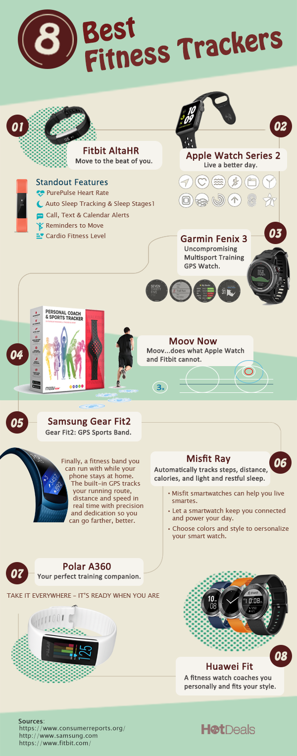
Infographic : 8 Best Fitness Trackers

Look for a fitness tracker recommendation though? Here’s the Top 8 Fitness Trackers, just for you. For example, Fitbit AltaHR-Move to the beat of you; Apple Watch-Live a better day. Stay connected when you’re away from your phone; Misfit Ray-Automatically tracks steps, distance, calories, and light and restful sleep, and so on. Find coupons of these online stores on HotDeals.com before your checkout. Save money and keep fit.

Infographic : 8 Best Fitness Trackers


6 of the Most Shared Marketing Infographics of 2017

What makes people share an Infographic? Nice colors? Exciting graphics? Or the content? As we head into 2018, we look back at the most shared infographics of 2017 on sales and marketing. What do you think is the secret of an infographic, going to be viral overnight?

Is that the creative design or the unique content?

Take a look at these 6 Most Shared Marketing Infographics of 2017. The reason why these infographics became widespread is the use of colors, powerful data information, image dominance and focus on the niche audience. The informative infographic gives an insight of the history of the content marketing and how it has evolved.

Infographic Source:- www.infographicdesignteam.com

6 of the Most Shared Marketing Infographics of 2017


Infographic : What Factors Affect Internet Connection Speed

Having fast and stable Internet connection is a must in today’s busy world. Nobody likes waiting for a website to load or not being able to stream his or hers favorite movie on Netflix. But what factors affect your Internet connection? Tech geeks from BlueGadgetTooth designed this Infographic that shows 10 factors that can be affecting your Internet speed. From the type and performance of your wireless router to software and browser you’re using, we’ve got you covered!

Infographic Source:- bluegadgettooth.com

Infographic : What Factors Affect Internet Connection Speed